After exploring visual hypotheses we believed in, we conducted a test between the hypothesis and the original visual brand.
After only 2 weeks, we already started to see the new visual performed 184% better than the original. This gave the founders the confidence to implement the brand throughout the rest of the website.
After only 2 weeks, we already started to see the new visual performed 184% better than the original. This gave the founders the confidence to implement the brand throughout the rest of the website.
Overarching Brand Goal
My goal for the first year of introducing the new brand was to paint a wide foundation. This meant redesigning as many webpages as we could. Starting with the highest traffic pages.
Website Project Management Spreadsheet
The next page we prioritized was the Address API Page.
Our API audience is a big contributor to Shippo's overall revenue so it made sense to start with a new feature we recently launched. This was a tricky balance, because at the same time we were developing both our brand guide and visual systems. [See how]
Here is a look at what the API page looked like before.
Here is a look at what the API page looked like before.
Conceptually, we wanted the Address API Page to be a modular page that we can use for other subsequent pages we build in the future. We kept the art representative and approachable while keeping the language informative.
The published Address API Page
More Before/Afters
In the next year, we started redesigning a list of our highest traffic pages. Converting our old visual system into the new modernized brand. Here are some of the highlights.
API Page (before)
API Page (after)
Carriers Page (before)
Carries Page (after)
API Pricing (before)
API Pricing (after)
About Page (before)
About Page (after)
Elements Page (before)
Elements Page (after)
Navigation
One of the larger explorations we underwent in the website redesign was the navigation.
I lead design to create alignment between Product, Marketing, Web, and Engineering
I lead design to create alignment between Product, Marketing, Web, and Engineering
Not every idea made it, but it was interesting to introduce ways our marketing site can better connect with our product experience. Starting with our sign in experience.
We had limitations from both a product and engineering perspective but mocking up ideas like this helped all departments imagine what is possible.
We had limitations from both a product and engineering perspective but mocking up ideas like this helped all departments imagine what is possible.
Interactive hover tests
No design process would be complete without a little refinement.
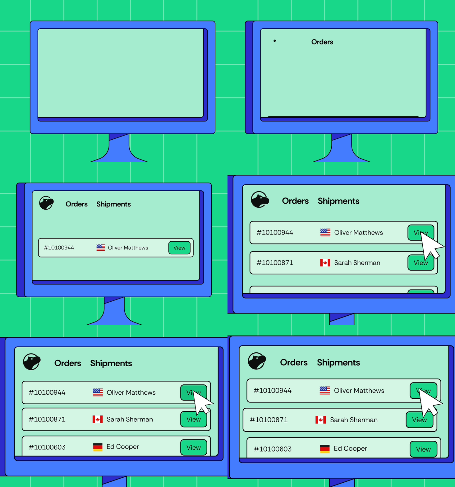
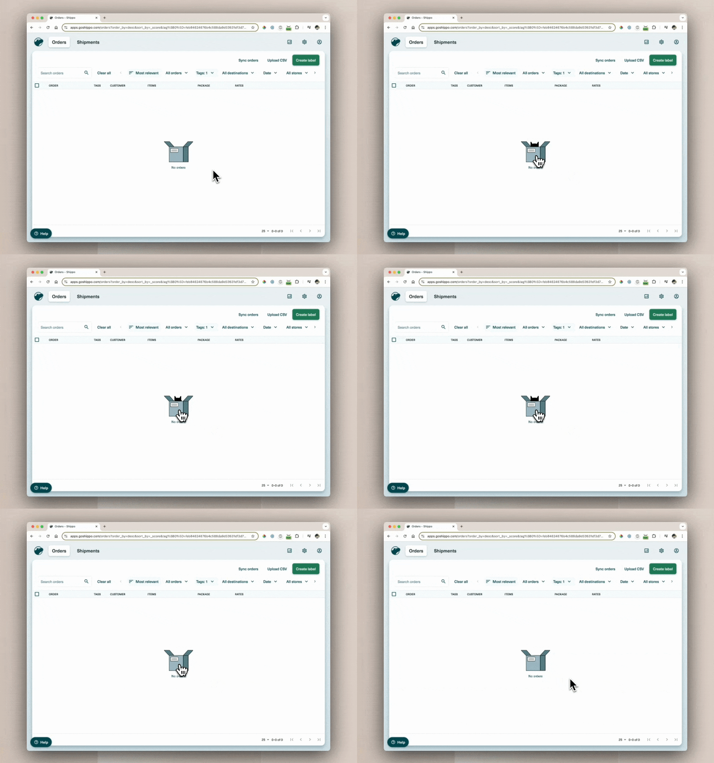
Here is a test of what the hover interaction would look like on web.
Here is a test of what the hover interaction would look like on web.
Building a component library
At the end of 2023, we created Shippo's Brand Visual System. And by the end of 2024, we redesigned more than 14+ web pages.
Through 2025, we continue iterating and improving the site. To see it all live, check out shippo.com
Through 2025, we continue iterating and improving the site. To see it all live, check out shippo.com
Sponsors:
Role: Brand Design Lead
Type: Brand Redesign
Status: Ongoing, Published Dec 2024


